


Introduction
What do Reddit, Discord, Medium, and LinkedIn have in common? They use what’s called a skeleton loading screen for their applications. A skeleton screen is essentially a wireframe of the application. The wireframe is a placeholder until the application finally loads.
Rise of skeleton loader.
The term “skeleton screen” was introduced in 2013 by product designer Luke Wroblewski in a blog post about reducing perceived wait time. In the post, he explains how gradually revealing page content turns user attention to the content being loaded, and off of the loading time itself.
Luke Wroblewski blog's link - lukew.com/ff/entry.asp?1797
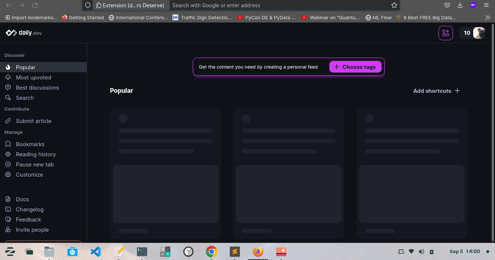
Skeleton Loader
Skeleton loading screens will improve your application’s user experience and make it feel more performant. The skeleton loading screen essentially impersonates the original layout. This lets the user know what’s happening on the screen. The user interprets this as the application is booting up and the content is loading.
In simplest terms, Skeleton Loader is a static / animated placeholder for the information that is still loading. It mimic the structure and look of the entire view.
Why not just a loading spinner ?
Instead of showing a loading spinner, we could show a skeleton screen that makes the user see that there is progress happening when launching and navigating the application. They let the user know that some content is loading and, more importantly, provide an indication of what is loading, whether it's an image, text, card, and so on.
This gives the user the impression that the website is faster because they already know what type of content is loading before it appears. This is referred to as perceived performance.
Skeleton screens don’t really make pages load faster. Instead, they are designed to make it feel like pages are loading faster.
When to use ?
- Use on high-traffic pages where resources takes a bit long to load like account dashboard.
- When the component contains good amount of information, such as list or card.
- Could be replaced by spin in any situation, but can provide a better user experience.
- Use when there’s more than 1 element loading at the same time that requires an indicator.
- Use when you need to load multiple images at once, a skeleton screen might make a good placeholder. For these pages, consider implementing lazy loading first, which is a similar technique for decreasing perceived load time.
When not to use ?
- Not to use for a long-running process, e.g. importing data, manipulation of data etc. (Operations on data intensive applications)
- Not to use for fast processes that that take less than half a second.
- Users still associate video buffering with spinners. Avoid skeleton screens any time a video is loading on your page.
- For longer processes (uploads, download, file manipulation ) can use progress bar instead of skeleton loading.
- As a replacement for poor performance: If you can further optimize your website to actually load content more quickly, always pursue that first.
Let's design a simple skeleton loading.
Sample skeleton loader in live in : syedjafer.github.io/skeleton-loader/index.h..
HTML Code
<!DOCTYPE html>
<html>
<head>
    <meta charset="utf-8">
    <meta name="viewport" content="width=device-width, initial-scale=1">
    <title>Skeleton Loading</title>
</head>
<body>
    <div class="card">
        <div class="card-skeleton title"></div>
        <div class="card-skeleton description"></div>
    </div>

</body>
</html>
CSS Styling
.card {
            width:  250px;
            height:  150px;
            background-color: #fff;
            padding: 10px;
            border-radius: 5px;
            border:  1px solid gray;
        }

.card-skeleton {
    background-image: linear-gradient(90deg, #ccc, 0px, rgb(229 229 229 / 90%) 40px, #ccc 80px);
    background-size: 300%;
    background-position: 100% 0;
    border-radius: inherit;
    animation: shimmer 1.5s infinite;
}

.title {
    height: 15px;
    margin-bottom: 15px;
}

.description {
    height: 100px;
}

@keyframes shimmer{
    to {
        background-position: -100% 0;
    }
}
Live Loading
Suggestions to keep in mind
- The goal is to design for a perception of decreased waiting time.
- Contents should replace skeleton exactly by position and size immediately after they are loaded.
- Using motion that moves from left to right (wave) gives a better perception of decreased waiting time than fading in and out (pulse).
- Using motion that is slow and steady gives a perception of decreased waiting time.